
2023 Top Pantone Colour Trend: How to Use Pantone’s Classic Blue
What do Marsala, Rose Quartz, Serenity, Greenery, Ultra Violet and Living Coral have in common?
Answer: They’ve all been named Pantone Colour of the Year in the past five years. (The Pantone Color Institute couldn’t quite make its mind up in 2016 so gave us two picks in case you’re wondering why the numbers don’t add up.)
Previous Pantone COTY style shapers have included Tangerine Tango, Emerald, Honeysuckle, Cerulean Blue (hello Meryl in The Devil Wears Prada) and Chilli Pepper, influencing everything from homewares and fashion, to industrial design and product packaging.
But why these colours? And who decides?
Each year’s pick is based on trends the Pantone colour experts uncover as they scour the world analysing trends and searching for new colour influences.
They look at entertainment and films in production, travelling art exhibitions and new artists, fashion, design and popular travel destinations, along with new lifestyles, playstyles and socio-economic conditions to arrive (usually) at a single colour choice.
PANTONE 19-4052
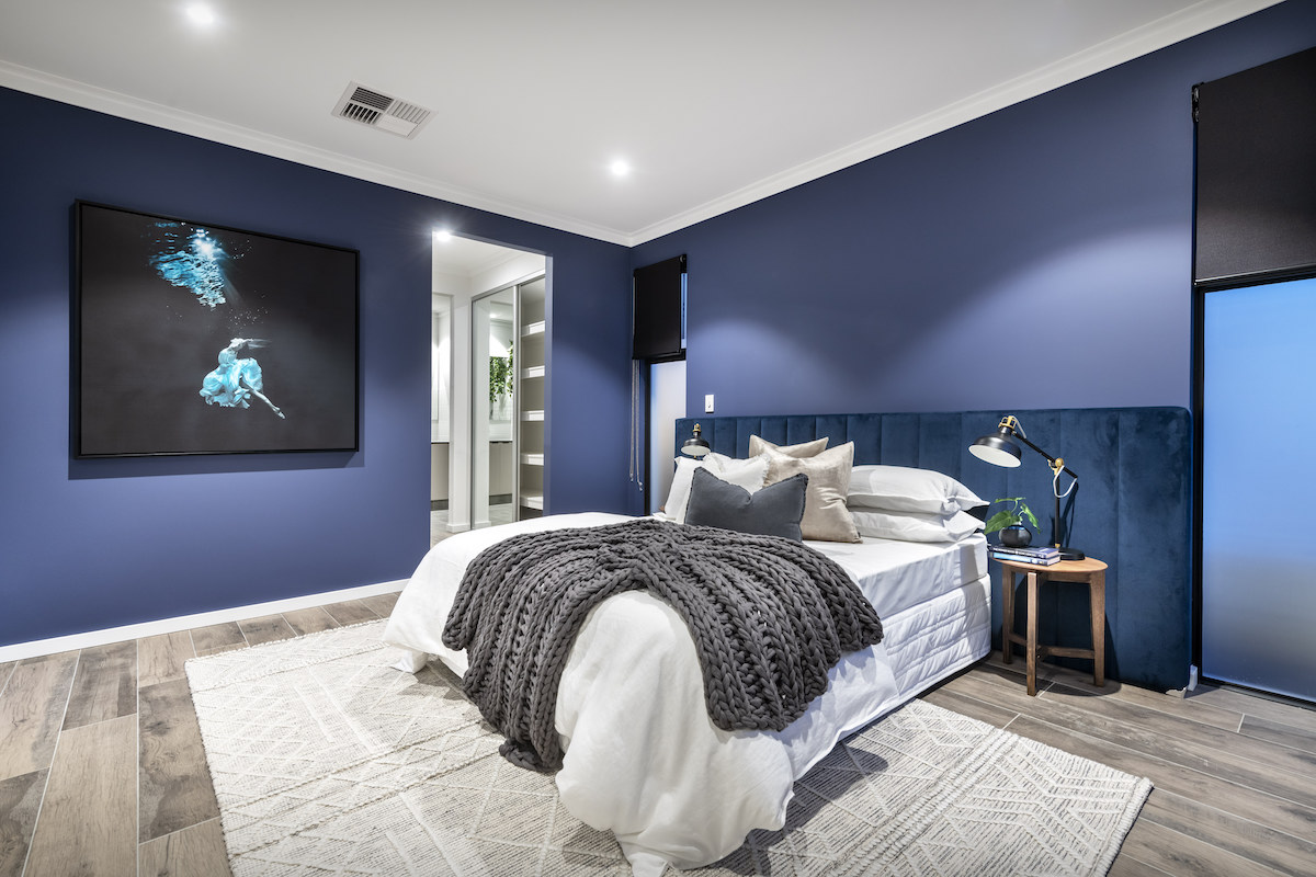
This year, the American colour company has brought us Classic Blue as its all-important colour pick for 2023.
Otherwise known as Pantone 19-4052, this deliciously familiar blue – think blueberries, denim and a dusky sky – has been chosen, we’re told, to help ease us into a new decade.
“We are living in a time that requires trust and faith,” declared Leatrice Eiseman, Executive Director of the Pantone Color Institute.
“It is this kind of constancy and confidence that is expressed in Pantone 19-4052 Classic Blue, a solid and dependable blue we can always rely on.
“A boundless blue evocative of the vast and infinite evening sky, Classic Blue encourages us to look beyond the obvious to expand our thinking; challenging us to think more deeply, increase our perspective and open the flow of communication.”
Awesome.
But what about some insights to help us keep up with the style-setters and use the latest colour trend in our home?
TOP TIP
Thankfully we have Kestryn Chaloner, our own in-house colour expert, to help with that one.
Turns out Classic Blue is already on Kestryn’s colour radar.
“Yes, this is my personal favourite colour and one that’s very easy to work with, due to its calming, tranquil qualities,” Kestryn says.
While Pantone’s colour choice for 2020 has been somewhat controversial – with many colour-watchers disappointed a lush, sustainable, climate-friendly green didn’t make the grade – there’s no escaping the fact that Classic Blue is restful, timeless and oh-so-elegant in its simplicity.
It’s a really good colour.
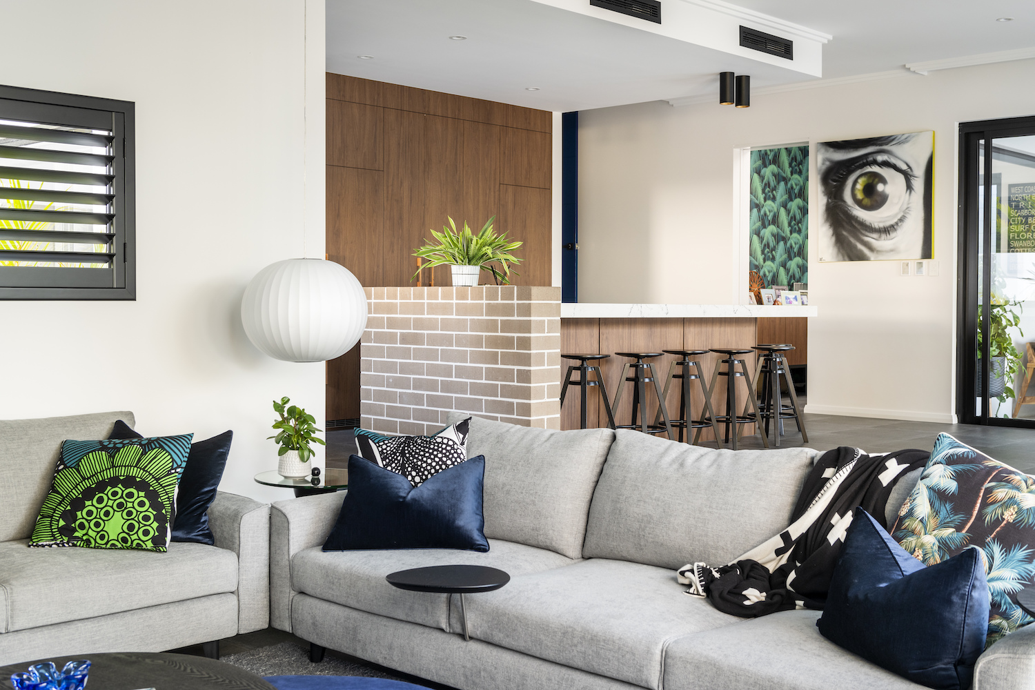
“I see Classic Blue making a statement this year, whether it’s as a painted feature wall or wallpaper, in furniture, window treatments or even a painted front door like I have at home,” Kestryn says.
“We’re also likely to see lots of blue accessories, especially ceramics.”
Kestryn’s top tip when it comes to embracing Classic Blue a.k.a. Pantone 19-4052?
“As with many things in interior design, a little goes a long way,” she says.
“Don’t over-do the colour. Use it subtly, whether it’s in soft furnishings such as cushions, towels or a feature piece of furniture.”
Blueberry muffin anyone?